

There are lot of things to talk about media queries and a lot of things to learn. In this article I'm going to discuss the main purpose of media query and how we use media query most of the times.
What are Media Queries?
Media queries are a way to target the browser by some characteristics, features and user preferences and then apply style based on that. Basically, we set some conditions in by writing media queries for a website or app and the appearance or even the behavior of the websites or apps will get modified when the the queries matches user's browser or system settings. The most common media queries we write to target the particular viewport ranges or in one word to make the websites or apps responsive.
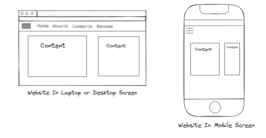
Now, the question arise what is responsiveness? So, when write CSS code or see the design from our system and only design the program based on that, it can cause many problems or may not look properly in other devices which doesn't have the same screen size or viewport size like our device. Like if we design a website from our laptop and write code only based on the viewport size of the laptop then it will most likely not look properly for my phone or for a wide angle screen. So, while writing CSS we have to make sure that our website looks proper and everything is properly working for the other devices as well. That is responsiveness. The responsive websites looks and work properly from any device and to achieve the responsiveness we use Media Queries.
There are a lot of things we can target besides viewport width like screen resolution, device orientation, operating system preference etc.
How To Use Media Queries?
We mostly use media queries in CSS but they can be used in HTML or JavaScript as well. Here is the basic syntax for writing media queries in HTML, CSS and JavaScript.
- HTML : In HTML in the
linkelement inside theheadtag we can write our media query like this - ```
- JavaScript : We can also use Media Queries in JavaScript. But I'll not talk much about that. Here is a basic syntax for media query in JavaScript -
const mediaQuery = window.matchMedia( '(min-width: 400px)' )After this, we also have to do some more steps but will talk about them any other time and will focus on the CSS now.
CSS Media Queries
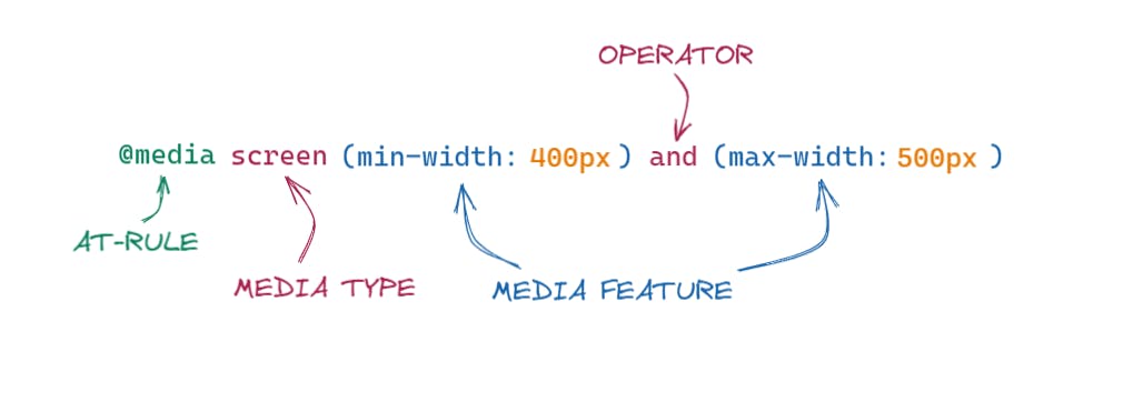
@media
This is the first thing that we have to write to write a media query in CSS. It is one of the many CSS at-rules.
Media Types
After @media we have to mention what type of media we want to target. Most of the time we use screen here but it is not the only type we have. Some of the other types are -
all : It matches all the devices.
print : It matches documents that are viewed in a print preview.
screen : It matches devices with a screen.
speech : It matches the devices that read the content audibly such as screen reader.
Media Features
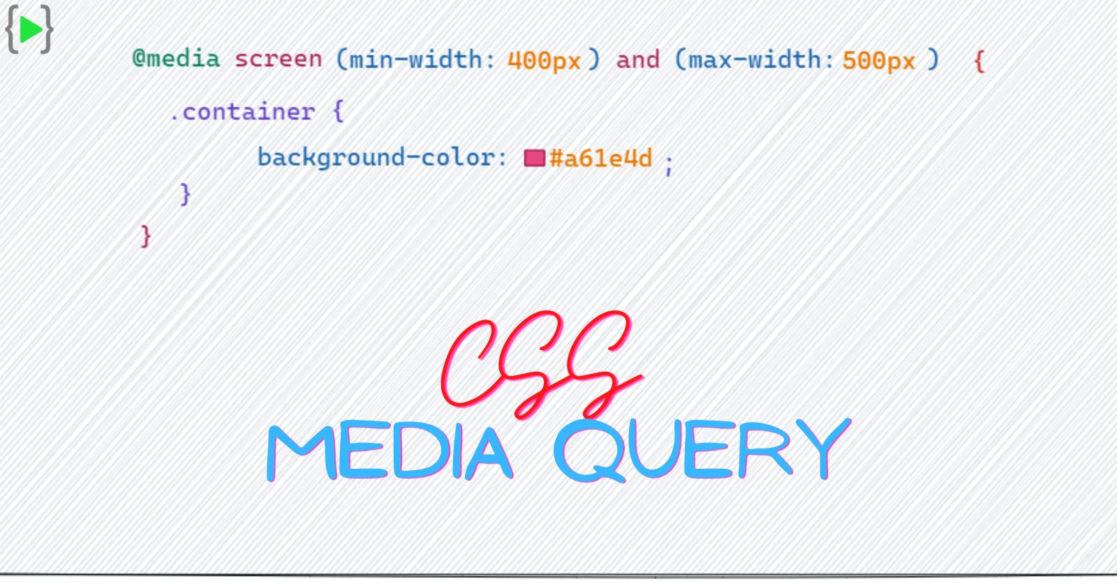
After mentioning the media type we have to mention which media features we are trying to match. In the above image after mentioning screen we mentioned min-width and max-width, these two are media features and it means the query matches the width of the screen according to the value of min-width and max-width. There are so many media features like orientation, resolution, color, hover etc.
Operators
The Media Query supports some logical operators like programming languages so that we can match media types based on certain conditions -
and: We can use this operator if we want to target screens within a range of widths@media screen only (min-width: 400px) and (max-width: 500px) { .container { background-color: #CAD5E2; } }or: We can also useoroperator or we can use a comma ',' in place oror-@media screen only (max-width: 500px), (min-width: 800px) { .container { background-color: #CAD5E2; } }These will be treated like two separate media queries.not: If we want to target the device by what they do not support or match. The below code removes the body's background color and when the device is a printer and can only show one color.@media print and ( not(color) ) { body { background-color: none; } }
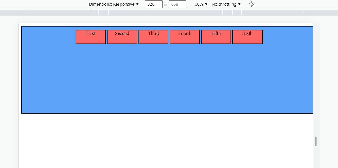
Here is an example with code and images -
<!DOCTYPE html>
<html lang="en">
<head>
    <meta charset="UTF-8">
    <meta http-equiv="X-UA-Compatible" content="IE=edge">
    <meta name="viewport" content="width=device-width, initial-scale=1.0">
    <title>Media Query</title>
    <style>
        .container {
            margin: auto;
            width: 900px;
            height: 250px;
            border: 2px solid black;
            background-color: #CAD5E2;
            padding: 10px;
            display: flex;
            gap: 4px;
            justify-content: center;
        }

        .container div {
            background-color:#FF6666;
            border : 2px solid black;
            height: 40px;
            width: 90px;
            text-align: center;
        }


        @media only screen and (min-width: 400px) and (max-width: 900px) {
            .container {
                background-color: #5DA3FA;
            }
        }
    </style>
</head>
<body>
    <div class="container">
        <div>First </div>
        <div>Second </div>
        <div>Third </div>
        <div>Fourth </div>
        <div>Fifth </div>
        <div>Sixth </div>
    </div>
</body>
</html>
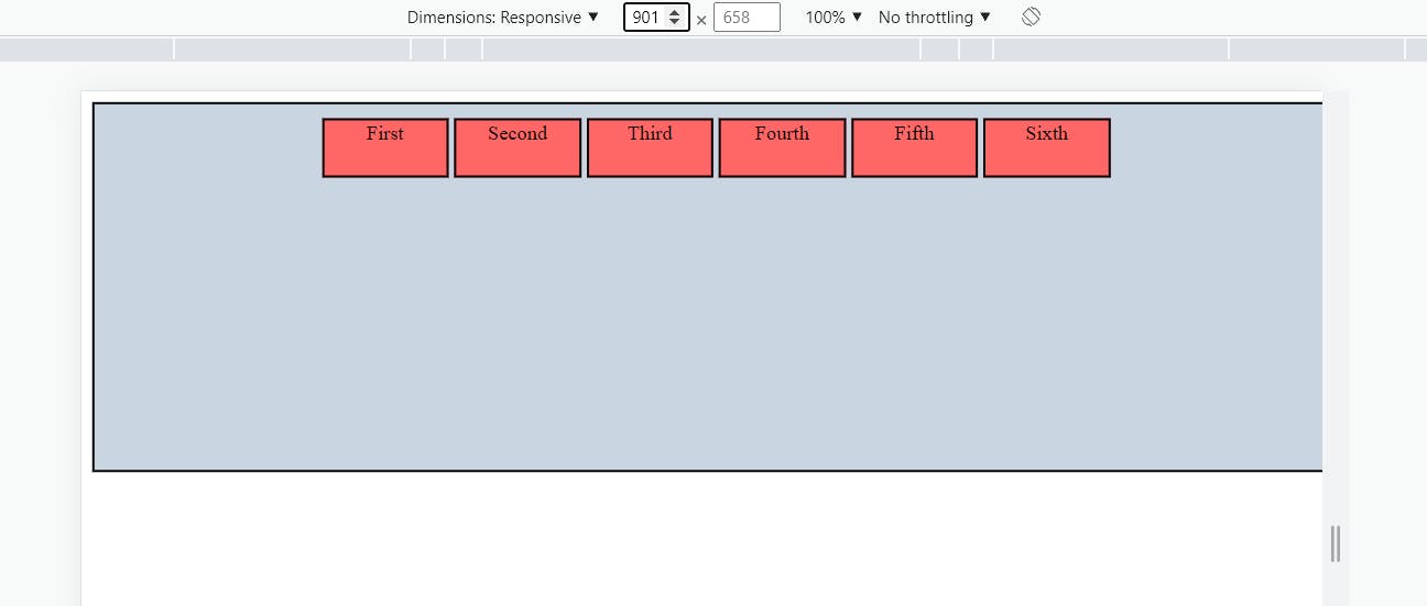
Now when the screen size matches the 400px to 900px mark the media query executes and we get the below output -
That's all about Media Query. There is so much more to talk about these but will do that on any other day.