


What is CSS Flexbox?
Flexbox is a one-dimensional layout method that helps us in arranging items of a container in row and columns, even when the size of the items are unknown. It gives the container the ability to alter the items' width, height and order to best fill the available space. A flex container expands its items to fill the available free space or shrinks items to prevent overflow. Flexbox is a great way to get more flexibility to our layouts and simplify the responsive layout design.
Why Flexbox?
The main advantage of flexbox is that it simplifies the responsive layout design. It is very easy to align items on a 2d plane with the flexbox and it's properties. For a long time the only reliable tools available for creating layouts were features like position and float. But these tools have some limitations and some simple layout designs are very difficult to make using those tools, for example -
Vertically centering a block content inside its parent.
Making all items of a container take up equal amount of width or height regardless of how much width or height is available.
In a multiple column layout, making all columns to take an equal amount of height even if they contain different amount of content. These were very difficult to achieve without flexbox. So without wasting any time let's jump into flexbox...
The Flex Model
When items of container are laid out as flex items, they are laid out along two axes - the Main axis and the Cross axis.
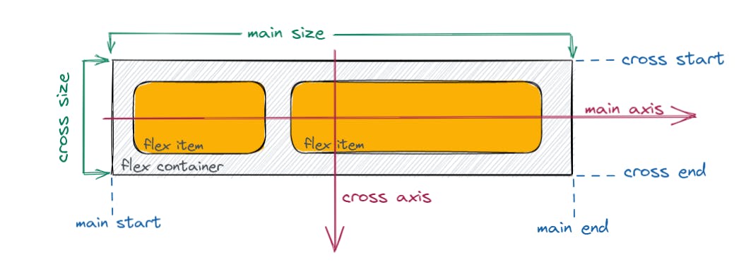
Main Axis : The main axis is the flex container's primary axis along which the flex items are laid out. The start and the end of the axis is called Main Start and Main End. In the image it is the horizontal red line but it is not necessarily horizontal. Flexbox provides a property called flex-direction that specifies which direction the main axis runs. We will talk more about flex-direction later on.
Cross Axis : The axis perpendicular to main axis is called cross axis. It's direction depends on the main axis direction. The start and end of cross axis is called Cross Start and Cross End.
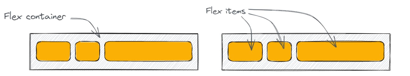
Flex Container and Flex Items : The parent container which has the display : flex; property is called the flex container and the items inside the flex container is called the flex items.
Flexbox Properties
There are basically two types or two set of properties, one set applied to the Flex Container or the Parent and others are applied to the Flex items or the children. Let's talk briefly about them -
Properties for Parent (Flex Container)
display
The first step to create a flexbox container is to set display : flex; for the container.
.flex-container {
    display : flex;
}
Here is an example of display property with code. Here you can remove the display:flex property or can do any other change and can see the output live -
flex-direction
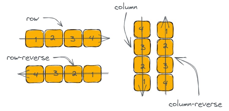
This property sets how to flex items are placed in the flex container and defines the main axis and the direction.
.flex-container {
    flex-direction : row | row-reverse | column | column-reverse;
}
From the above image we can see how the items is placed for different values of flex-direction.
flex-wrap
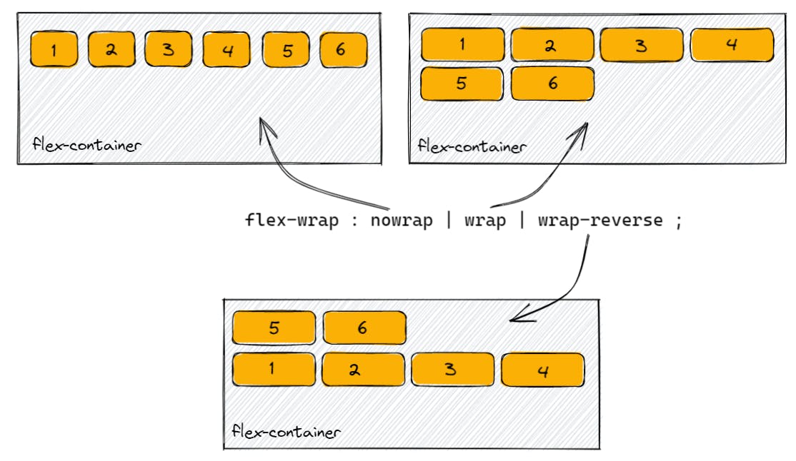
By default the flex items will try to fill into one line by shrinking their width or height. But we can change that by using the flex-wrap property. By default the value of flex-wrap is nowrap where the items tries to fill into one but it can be changed using the value wrap or wrap-reverse.
.flex-container {
    flex-wrap : nowrap | wrap | wrap-reverse;
}
wrap : It allows the flex items to wrap onto multiple line from top to bottom as shown in the image above.
wrap-reverse : It allows the flex items to wrap onto multiple line from bottom to top as shown in the image above.
flex-flow
This is just a shorthand for flex-direction and flex-wrap. We can specify flex-direction and flex-wrap individually in two lines or we can use this flex-flow property like this -
.flex-container {
    flex-flow : column wrap ;
}
By default it's value is flex-flow: row nowrap;
Now, Here is an example with code where you can change the values of flex-direction and flex-wrap and see how the items of the container behaves -
justify-content
The justify-content property defines how the space is distributed between and around the items along the Main Axis of the flexbox container. It's default value is flex-start.
.flex-container {
    justify-content : flex-start | flex-end | center | space-between | space-around | space-evenly | start | end | left | right......;
}
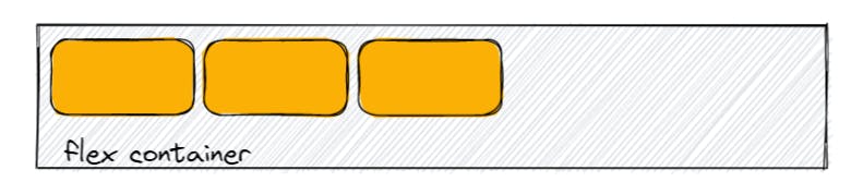
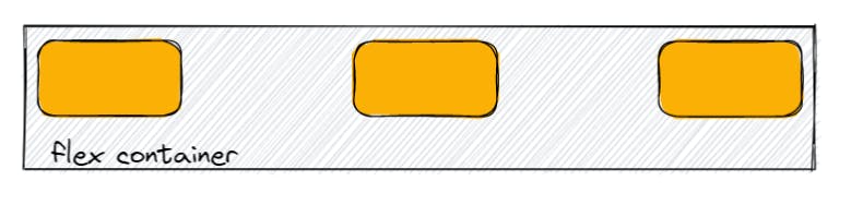
flex-start: The flex items will be packed towards the start of the flex-direction. It is the default value of justify-content. Here is an image for better understanding -
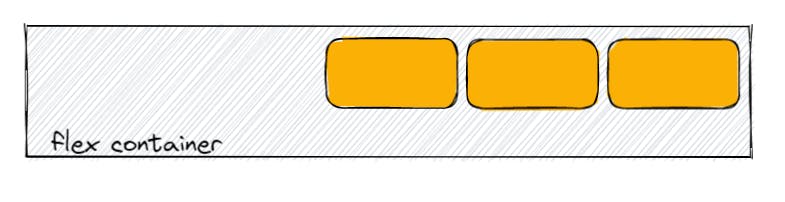
flex-end : The flex items will be packed towards the end of flex-direction as shown in the image -
start and end : For start the items will be packed towards the start of writing-mode direction and for end the items will be packed towards the end of writing-mode direction.
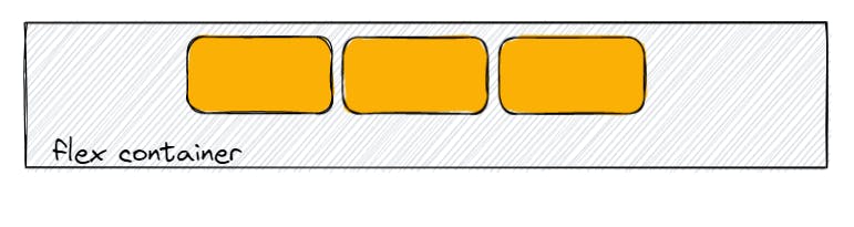
center : The items will be centered along the Main Axis.
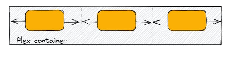
space-between : The flex-items will be evenly distributed along the Main Axis. The first item will be on the start line and the last item will be on the end line and the space between the items will be equal as shown in the below image -
space-around : The flex-items will be evenly distributed along the Main Axis with equal amount of space around them. Visually the spaces doesn't look like equal because the items have equal space on it's both side.
In the image we can clearly see the how the space is distributed around the items.
space-evenly : The items will be distributed along the Main Axis in a way so that the space between any two adjacent item and the space between the first or last and the edge of the container is equal. Let's see the below image for better understanding -
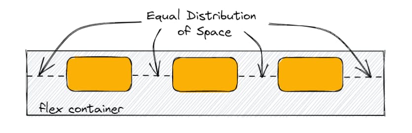
In the above image we can clearly see the space between the first item and start the edge or the last item and the end edge and the space between any two adjacent item is equal.
We have some more values also for justify-content like stretch, safe, unsafe, baseline etc. But they are not most commonly used so I will discuss about them any other day.
align-items
The align-items property defines the behavior for how the flex items are laid out along the Cross Axis on the current line. It is just like justify-content but it allows to align the items on the Cross Axis. It's default value is stretch.
.flex-container {
    align-items : stretch | flex-start | flex-end | center | baseline | start | end | self-start | self-end.....;
}
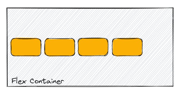
stretch : It is the default value of this align-items property. It stretches the items to fill the available space of the flex container while respecting the width and height constraints.
flex-start and flex-end : in flex-start items are placed at the start of the Cross Axis and in flex-end items are placed at the end of the Cross Axis (respecting the flex-direction).
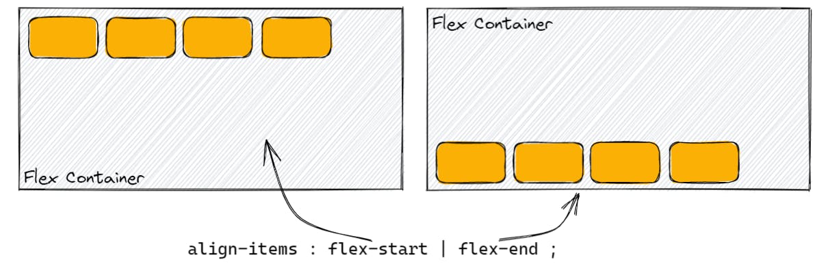
center : Items will be centered along the Cross Axis.
There are some other values also of this align-items property such as start, end, baseline, self-start, self-end, safe etc. The self-start, start, self-end and end are similar with little differences about respecting the flex-direction rules and writing-mode rules.
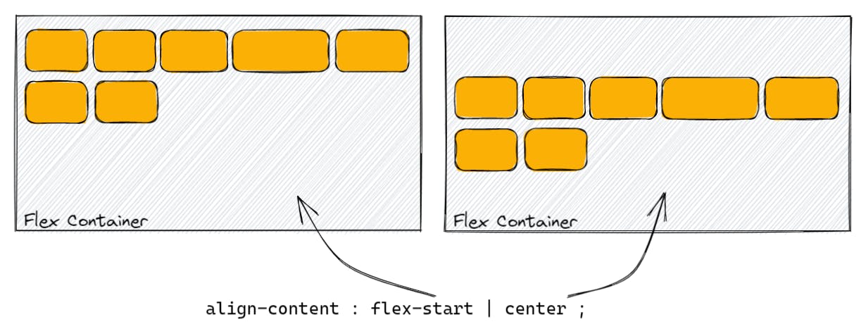
align-content
The align-content property is similar to align-items but it only takes effect on multiline flexible containers where the flex-wrap property is set to either wrap or wrap-reverse. It's default value is stretch and a single line flexible container will not have any effect for this property.
Here is an example with code for justify-content and align-items property. You can set different values to see different effect on the flex items -
You can also add more items in the flex container(just uncomment some lines in HTML and CSS) to see how the align-content works.
gap, row-gap, column-gap
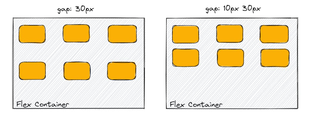
The gap property explicitly controls the space between two flex items. It only applies the space between two items but not on the outer edges. The syntax is -
.flex-container {
    row-gap : 10px;
    column-gap : 20px;
    gap : 10px;             /* row-gap and column-gap both will be 10px */
    gap : 10px 30px;        /* row-gap and column-gap*/
}
This property only takes effect when the space is between items after applying the properties like space-between, space-around and space-evenly is less than the space after applying the gap property. In the above editor you can try the gap property.
Properties for Children (Flex Items)
order
The order property control the order in which the flex items appear in the flexbox container. By default the flex items are laid according to the source order but we can change that with the order property. Here is the syntax -
.flex-item {
    order : 3;
}
The flex-items in the container are sorted ascending order value and then by their source code order. The default value of order is 0. Now, let's try different order value for different items in the code editor below for better understanding -
flex-grow
This property can control how much amount the flex-item takes compared to other flex-items. flex-grow takes a numeric value and represents a fraction of available space depending on the flex-grow value of the other items.
.flex-item {
flex-grow : 2;
}
```
It's default value is 0. As it is based on proportion setting up all the flex-items to `flex-grow` of 30 will be equal to setting all the items to `flex-grow` of 1. See the below image to understand clearly -

#### <u>*flex-shrink*</u>
This property is the opposite of `flex-grow` and defines how much the flex item can shrink compared to the other flex items. It's default value is 0 and and just like the `flex-grow` it is also based on proportion with the other items.
```
.flex-item {
flex-shrink : 2;
}
```
Negative values are invalid in both `flex-grow` and `flex-shrink`.
#### <u>*flex-basis*</u>
This property sets the initial main size of the flex item or defines how much starting space the item takes. But it is not a guarantee as it depends on how much space is available. It's default value is `auto`.
```
.flex-item {
flex-basis : auto | 0 | max-content | min-content | 10px | 20%....;
}
```
#### <u>*flex*</u>
It is just a shorthand property of `flex-grow`, `flex-shrink` and `flex-basis` combined.
```
.flex-item {
flex : <flex-grow> <flex-shrink> <flex-basis>;
}
```
The second and third parameter (`flex-shrink` and `flex-basis`) are optional here. It's default value is `0 1 auto`.
Now, in the below editor you can change the value of `flex` (`flex-grow`, `flex-shrink` and `flex-basis`) to understand more about these properties by seeing the outputs -
<iframe height="405.60003662109375" style="width: 100%;" scrolling="no" title="Untitled" src="https://codepen.io/Sayantan23/embed/eYKyMZe?default-tab=css%2Cresult&editable=true&theme-id=dark" frameborder="no" loading="lazy" allowtransparency="true" allowfullscreen="true">
See the Pen <a href="https://codepen.io/Sayantan23/pen/eYKyMZe">
Untitled</a> by Sayantan Ghosh (<a href="https://codepen.io/Sayantan23">@Sayantan23</a>)
on <a href="https://codepen.io">CodePen</a>.
</iframe>
#### <u>*align-self*</u>
This property is exactly similar like `align-items` but this is only for specific flex items whereas `align-items` is for all the flex items inside a flex container.
```
.flex-item {
align-self : auto | flex-start | flex-end | center | baseline | stretch....;
}
```
For better understanding you can read the section where I discussed about `align-items` or you can also see the below image -

Now, I've discussed about almost everything about CSS Flexbox. Hope this can help you to understand more about Flexbox.